

To complete the functional feature set of Reken, there was still one feature missing: "Named Slots." "Named slots" make components more versatile and flexible.
Reken already supported "slots," but was still lacking "Named slots." Since I wanted Reken components to be on par with Web Components, it was necessary to add "Named Slots."
So, what are "Named slots," and what can you do with them? Before answering that, we first need to discuss Components. Components allow you to create a new HTML tag, which you can then reuse repeatedly on your web page. Let's create a simple component called hello-world.
<template data-component="hello-world">
    <div>Hello World</div>
</template>
We can now add this component to our web page with:
<hello-world></hello-world>This will display the text hello world in your browser.
Now, we can make this more flexible and specify to whom we say hello. So, let's create a new component called hello, and we will introduce a slot where we can specify to whom we say hello.
<template data-component="hello">
    <div>Hello <slot>World</slot></div>
</template>
In the slot tag we provided the default slot content world, which we can override by specifying text in the body of the hello tag
<hello>Reken</hello>This will display the text `Hello Reken` in the browser window.
Now that we know what a slot does, we can discuss named slots. With named slots, you can specify more than the default slot on a component. To distinguish between the various slots, you name them and can then refer to them. For example, let's create a dialog component where you can specify a dialog title slot, a footer slot, and the default slot that contains the main area of the dialog.
<template data-component="base-dialog">
<dialog method="dialog">
    <header>
        <slot name="title"></slot>
    </header>
    <main>
        <slot></slot>
    </main>
    <footer>
        <slot name="footer"><button>Ok</button></slot>
    </footer>
</dialog>
</template>
We can now create various dialogs based on this base-dialog. For example a login dialog.
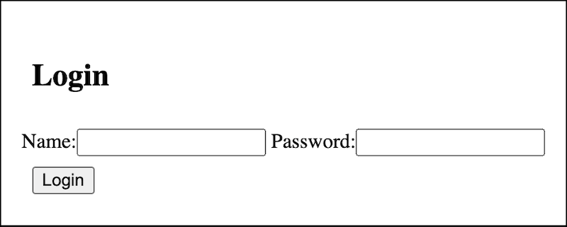
<base-dialog>
    <h1 slot="header">Login</h1>
    <form> <!-- default slot -->
        <label>Name:<input type="text"></label>
        <label>Password:<input type="password"></label>
    </form>
    <button slot="footer">Login</button>
</base-dialog>
This is how the login dialog looks:
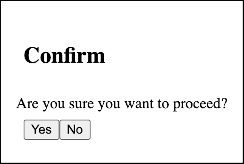
Or a confirmation dialog that asks you to confirm a given action.
<base-dialog>
    <h1 slot="header">Confirm</h1>
    <div>Are you sure you want to proceed?</div>
    <nav slot="footer">
        <button>Yes</button><button>No</button>
    </nav>
</base-dialog>
Here is how this confirmation dialog looks:
Now, you can apply this slot reuse to many other use cases. You can create template web pages with slots for the various parts of the page, or develop card layouts.
On the reken.dev site you can find a more comprehensive demo of named slots.
The implementation of the "Named Slots" feature concludes the roadmap of the runtime Reken functionality, a development I started in the spring of 2021. This does not mean the Reken project is finished. There are numerous implementation details I want to improve on. Also, there are opportunities in the area of tooling: server-side page generation, Web component support, npm integration, and so on.
And for sure some runtime usecase will pop up that warrants a new feature...