
If you have a Strava account and love statistics than Velo Viewer is for you. This website presents you with all the ride data you can dream of and more.
It has a very limited free version, a PRO version and a PRO+ version. Unless you are a Strava KOM hunter, I would recommend the PRO version. It costs a merely $15,- a year.
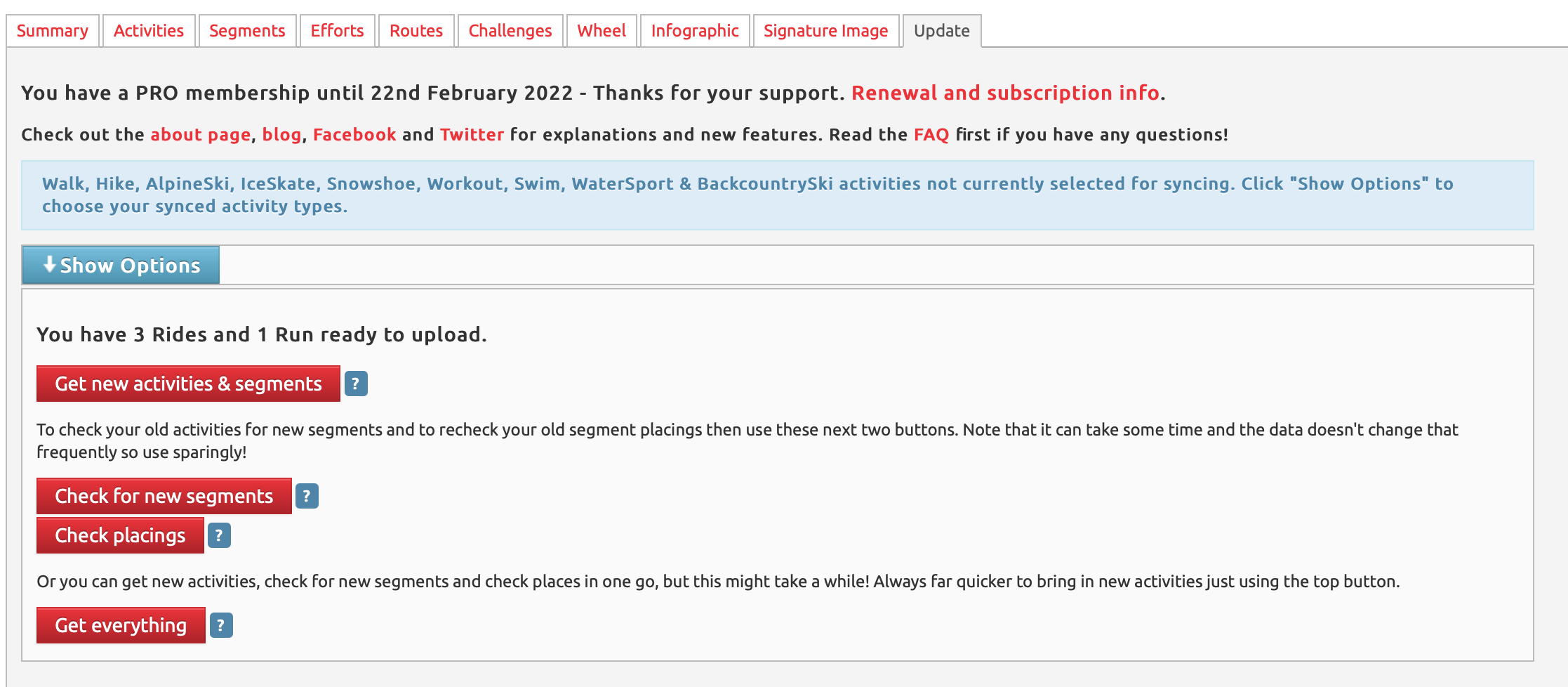
To start with Velo Viewer you first need to connect it with your Strava account. Once you activated the PRO version you can sync your Strava data to Veloviewer. Once you have new rides or runs on Strava you can update VeloViewer with the Update page. If you want to quickly update your ride info just hit the get new activities and segments button. If you want just Strava segments for the ride you already did click the new segments button. If you want your latest placings in the segments for all your rides click the Check placings button (this will take some time). Same with the Get Everything which will fetch well everything.
Once all your data is synced you can you can see how your statistics are affected.
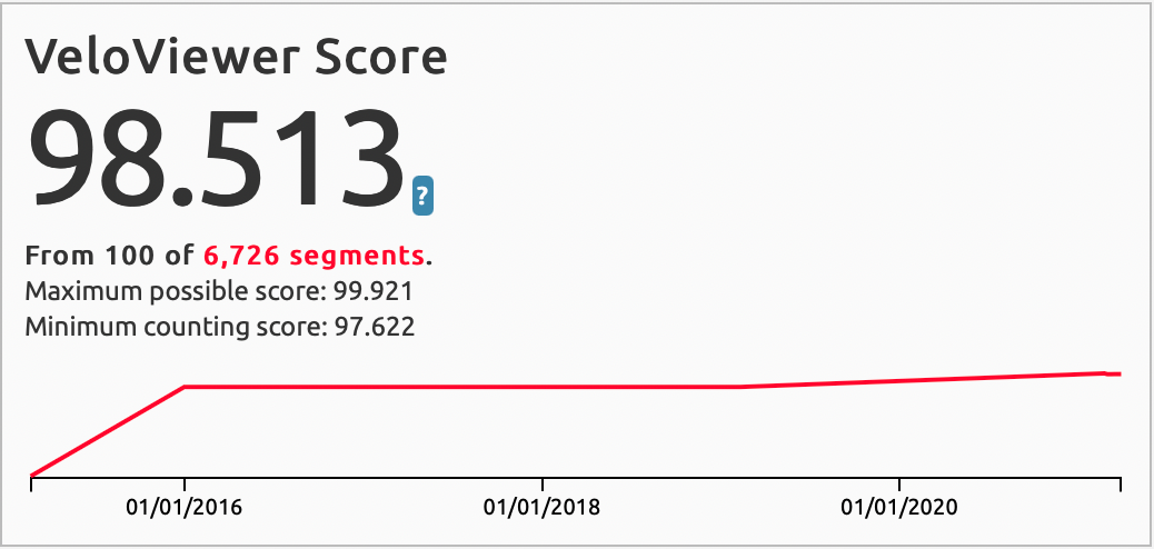
We will start with the summary dashboard. It defaults to all your activities. Here we find the Veloviewer score which shows how well you do on your top 25% / 100 Strava segments. If I read it correctly my score of 98.5 is pretty good.
Next are the Activity stats this shows standard stats like Total and Max activities for Distance, Elevation and Time. But also interesting stats like Edington score, K-score and Explorer score.
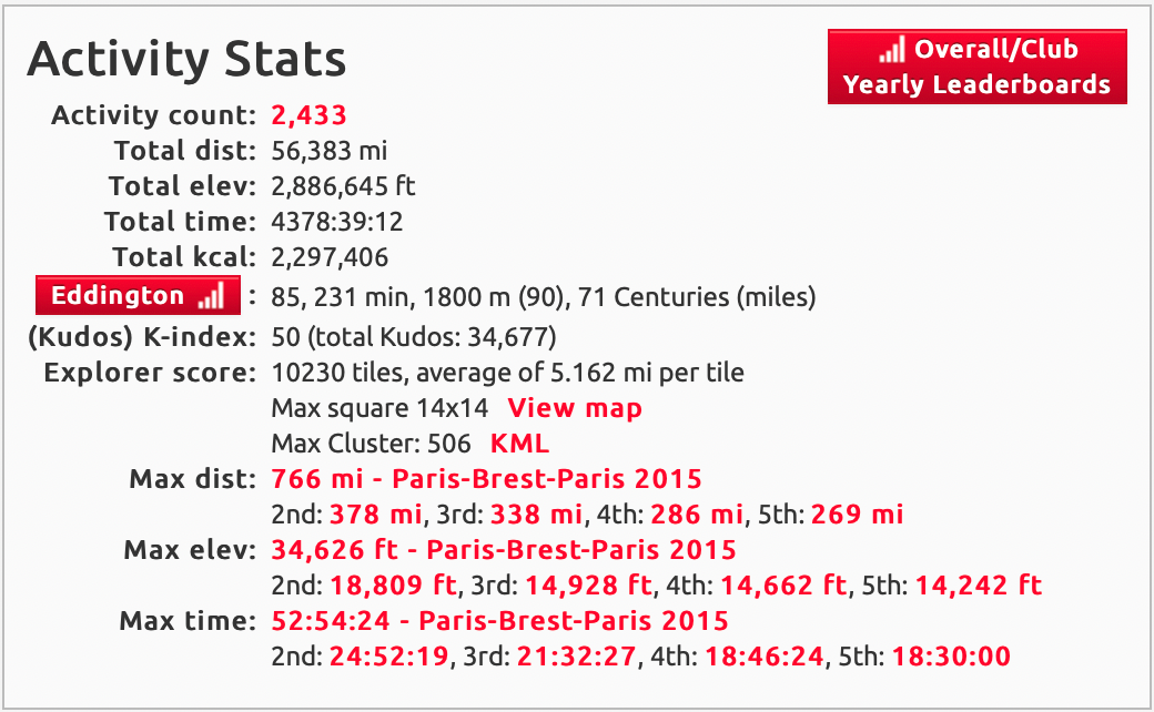
The Edington score shows the amount of rides with at least that number in miles ridden. In my case it is 85 which means I rode 85 rides with at least 85 miles. A nice milestone is to have this number at 100. Meaning 100 rides with at least a century in miles. Still have a ways to go... 29 centuries to be exact.
The K-index is similar to the Edington score, but now it is kudos per ride. In my case the index means I had 50 rides with at least 50 kudos.
The Explorer score shows hows you how much new terrain you cover on your ride. I have 10230 tiles with an average of 5.162 miles per tile. What is yours?
Next are the run statistics, it shows best times for various distances and the run it was achieved in. Seems there are no other run stats, not sure because I don't run that often

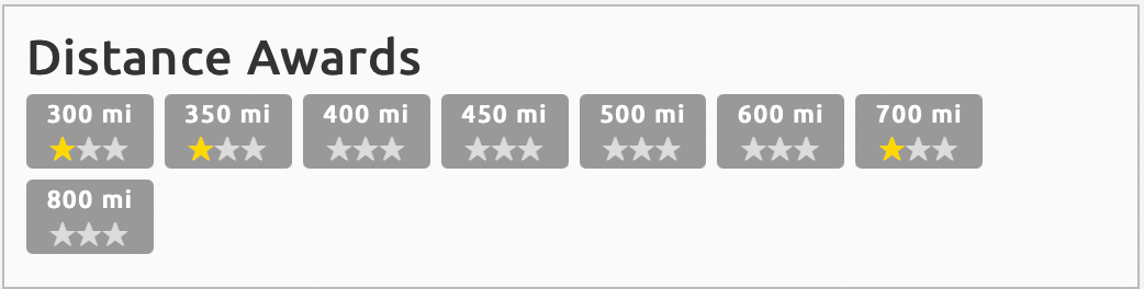
Then there are various distance, elevation and time award sections. I seem to lack a lot of stars. Perhaps challenges in the making...
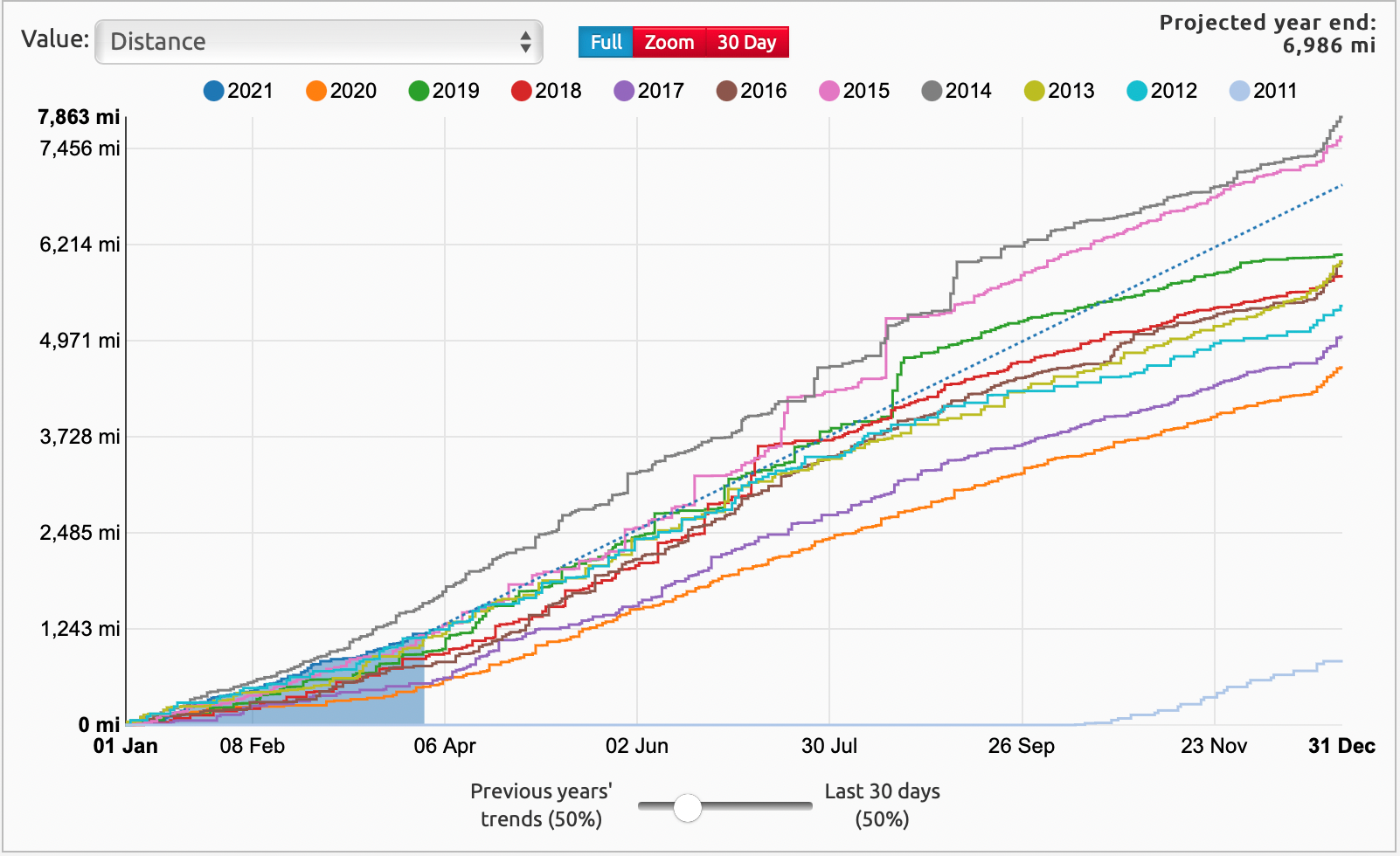
More interesting is the next chart that shows the cumulative distance by years. You can switch between 19 different data points. Interesting here was that 2014 was so far the year with the most distance. Other fun facts are that in 2020 I had the most activities and was also the year with the most days active. Makes sense. Lots to explore here.
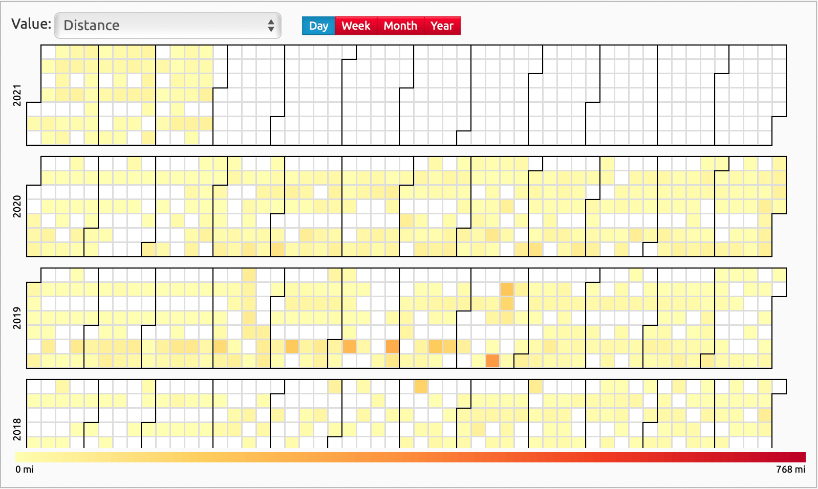
The next chart shows by day, week, month or year a heatmap of the data point choosen. For the distance my daily map looks a little pale yellow as my longest ride was 768 miles which skews all my rides to low end of the color spectrum. In this view you visualize 48 different datapoints.
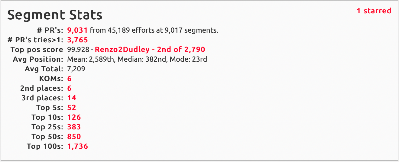
There are a few more charts: distance bar chart, segment stats, recent activities and gear summary. The latter has glaring feature missing: there is no sort on the columns.
The segment stats is interesting as it highlights your segment achievements. As you can see I'm not a KOM hunter. I only have 6 KOMs. But what is really cool that all the segments and activities are links that you can click to see them in more detail.
We now have reviewed two (Summary and Updates) of the ten pages. We'll continue with the other pages in part II.