
After having reviewed the Update and Summary pages on part I, today we will have a look at the Activities page.
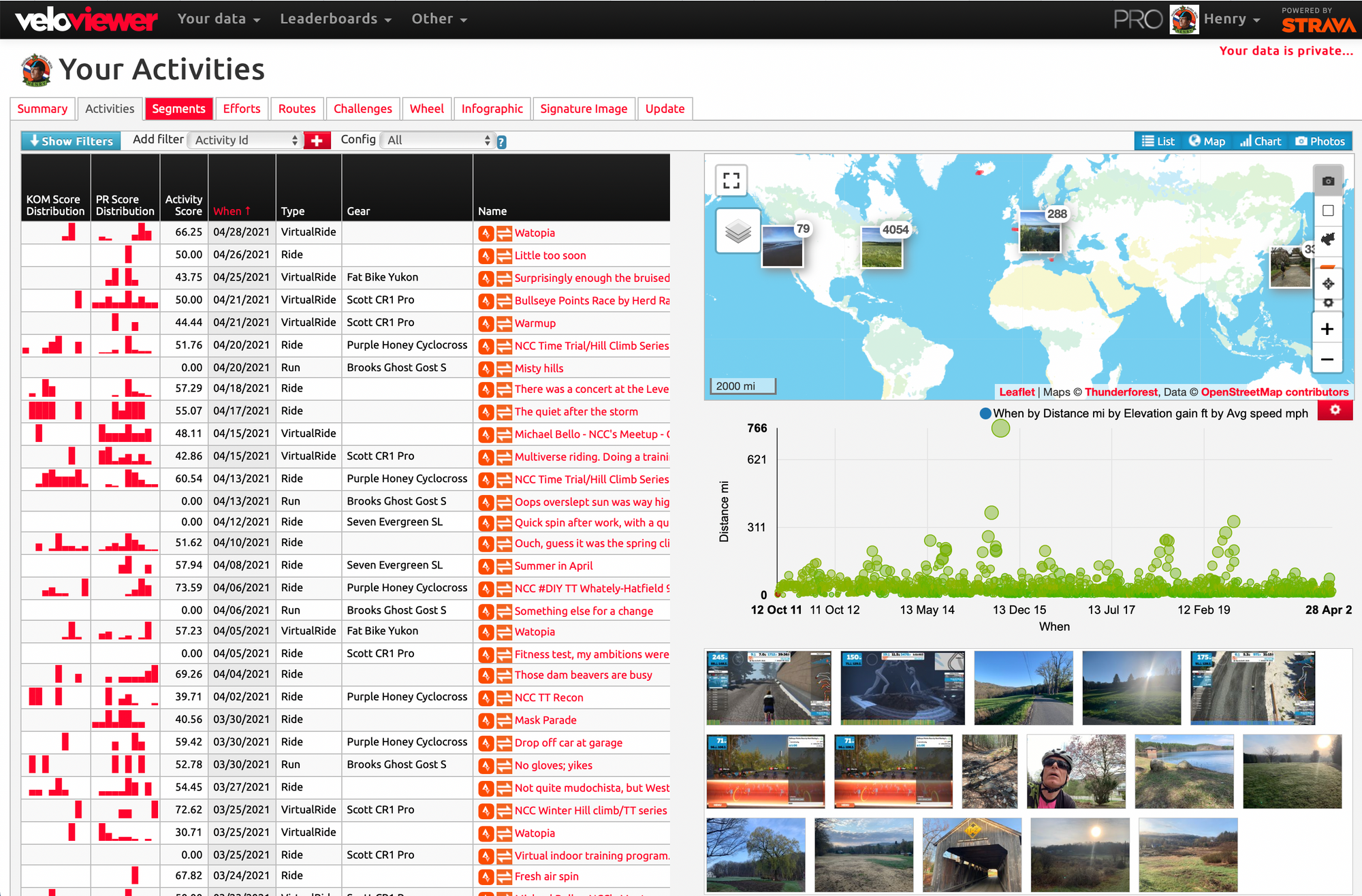
When you open the page it shows a table with your most recent rides. Every row in the table represents a ride and contains details about a ride, some details you would expect such as title, distance, start and elapsed time.
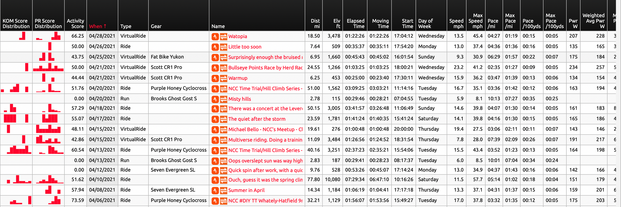
But there are also less obvious details such as KOM Score (how well you did KOM-wise). PR Score how well you did from a PR perspective and an overall Activity score which shows how well you did on all segments compared to previous rides.
You can click on any column header to sort the table based on that column in ascending and when clicked again on descending order. Fun to quickly rides with the longest distance, highest average power etc.
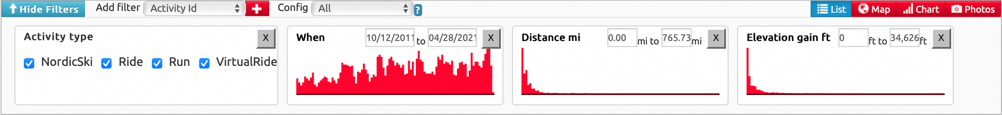
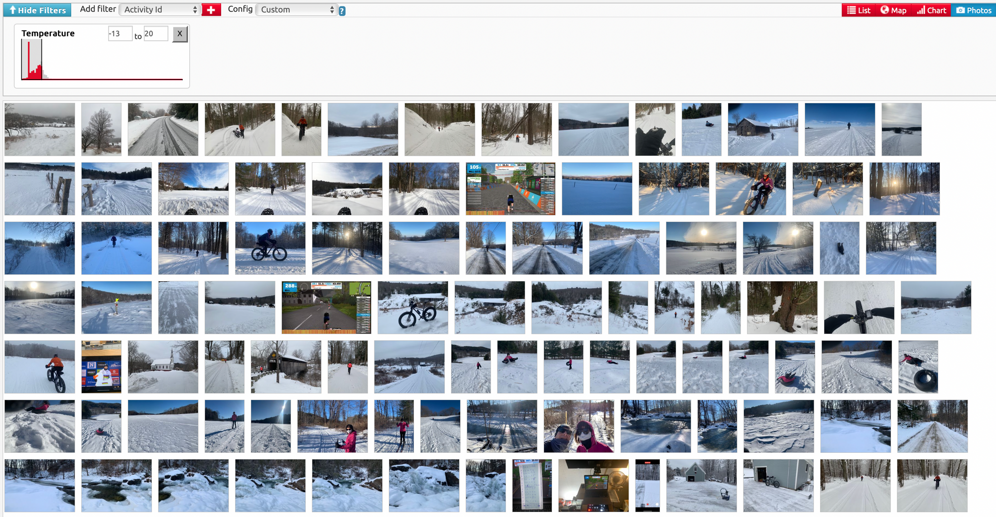
When you click on the filter button, a drawer with filter controls slides into view. There are some default filters such as Activity type, Date, Distance and Elevation Gain. And you can add more filters, there about 100 additional filters. Fun ones are Number of Photos, Kudos.
Besides the table view you can also display other views on your activities: Map, Chart and Photos. When blue the view is active, when red not. You can enable one to multiple to all views.

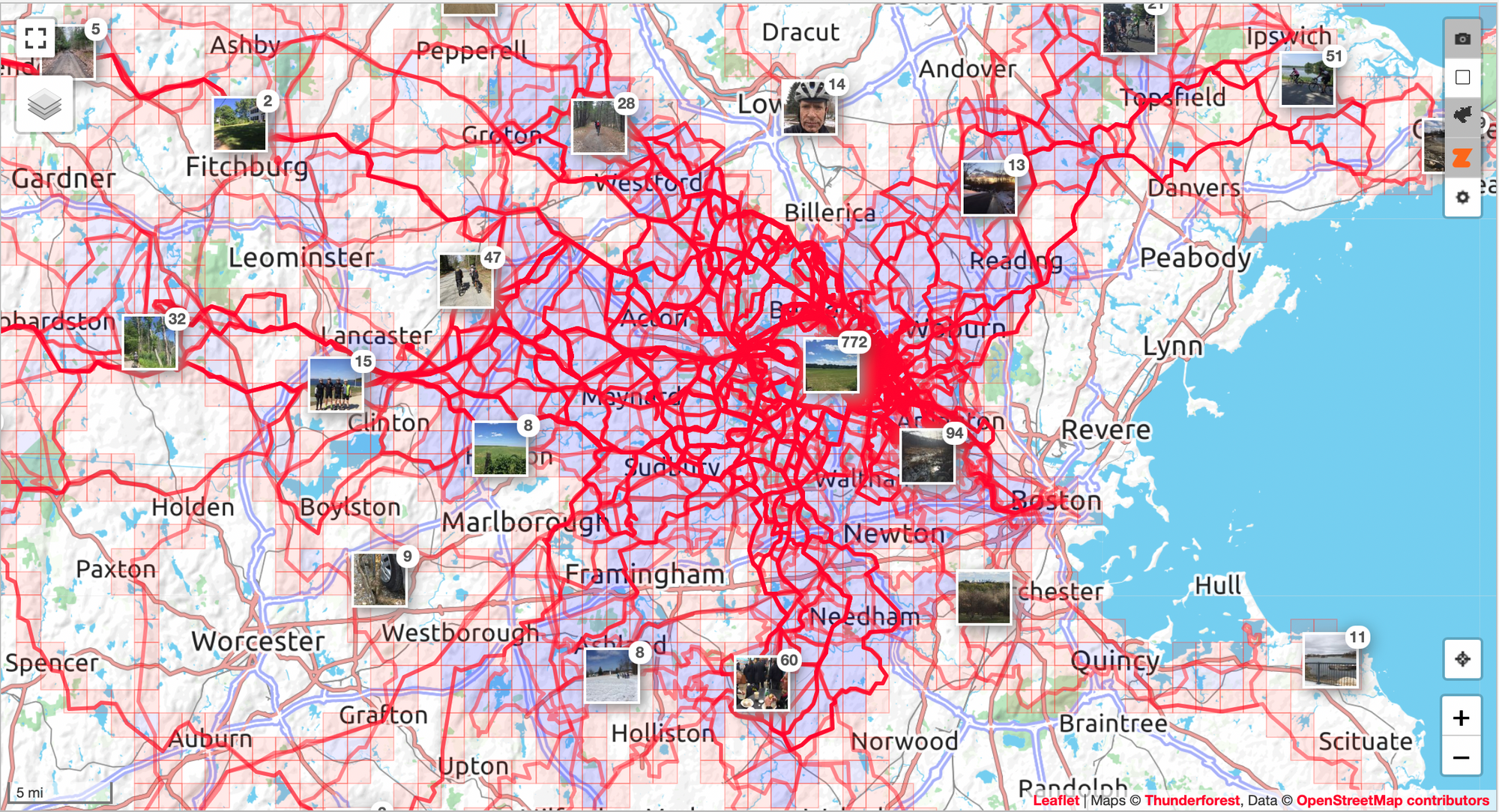
The Map view starts out with a world map with all your rides. It also shows stacks of your photos where you had taken them. You can now zoom into parts of the map and look at your rides and photos you did in that part of the world. Nice thing is that the filters still work. You can for example see all the rides where you received more than 50 of kudos.
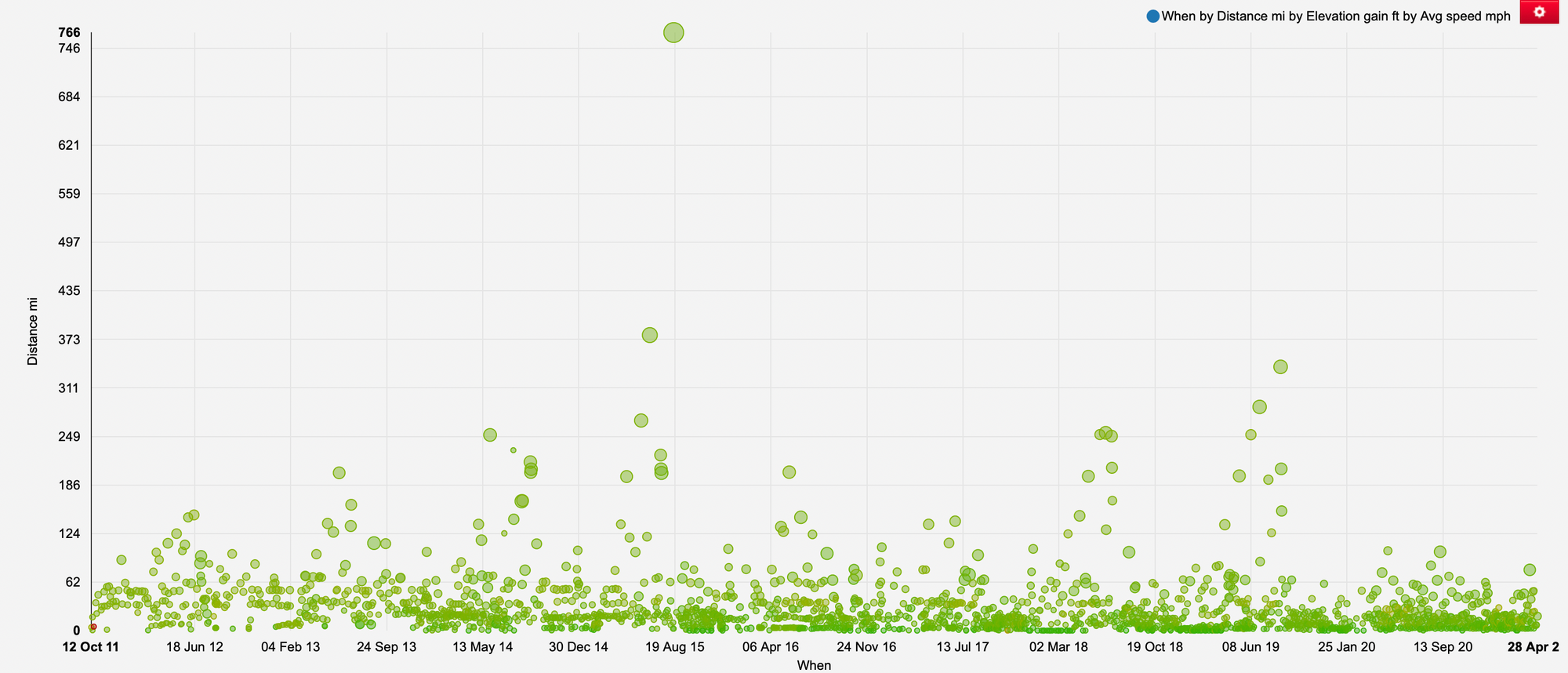
The chart view allows you to show your activities in a scatter chart, a column chart or a line chart. You can they choose any of the 100+ activity metrics and how they relate to each other. I did notice that with the amount of rides I had that it sometimes can take awhile to render a chart.
The last view is the Photos view it shows an ordered list of photos. You can then filter the photos by any of the 100 metrics. For example only Virtual ride photos showing your Zwift screenshots, or all photos of rides with a temperature below freezing to see some snow covered photos.
Next time we'll have a look at the Segments page.